Item Creation
& Item Edit Redesign
Wholesale Vendor Admin
Redesigning a dense legacy workflow into a clearer AI-assisted item creation experience for wholesale vendors.
Duration
September 2025 – January 2026
Team
Monica Hwang
Senior UX Designer
Product Manager
QA Team
Engineering
My Role
UX Research
Workflow Redesign
UX/UI Design
Design QA
Software
Figma
HTML/CSS Prototype
Heap Analytics

Reduction in
item upload time

Best admin update from a long-term vendor

AI-assisted description workflow
Context
The core page
vendors used every day,
unchanged for years
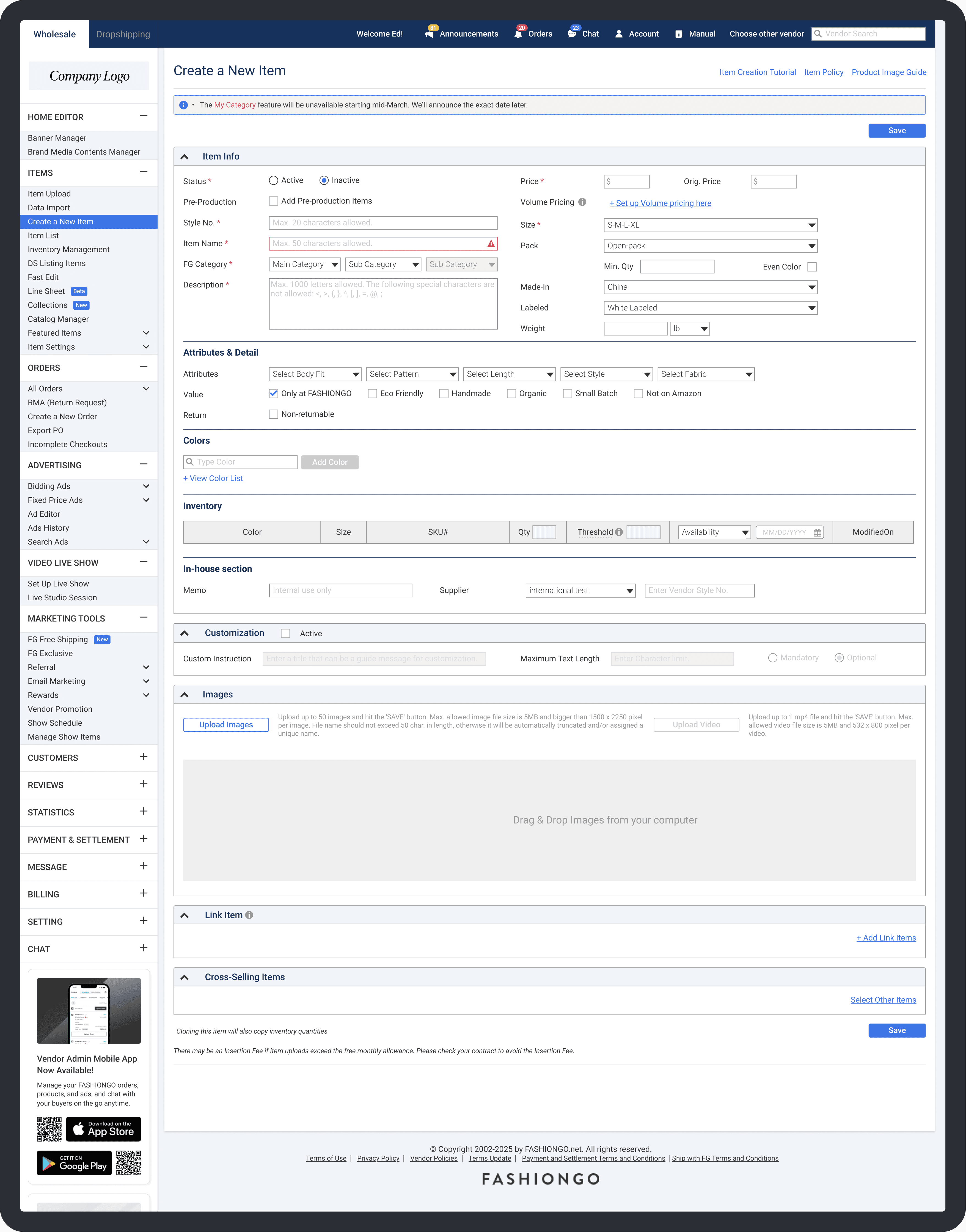
The item creation and edit pages were daily vendor workflows for creating and managing product listings. Since vendors updated items frequently, even small inefficiencies could affect sales readiness, buyer discovery, and store operations.


The original layout gave experienced vendors everything at a glance, but the same density made it harder for newer vendors to learn. The pages had gone largely unchanged for years.

MY ROLE
What I worked on
Workflow Redesign
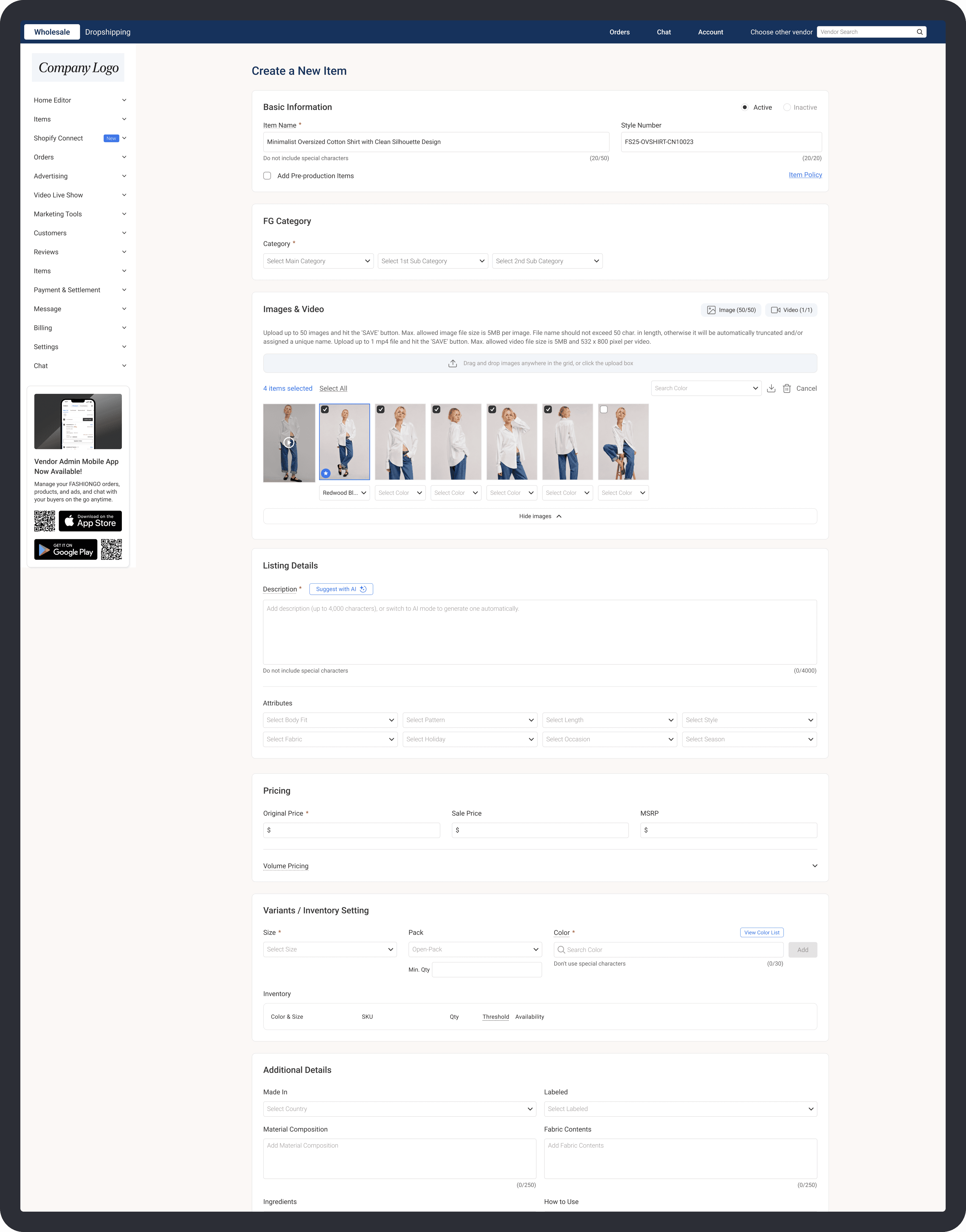
Redesigned the page hierarchy into a clearer, section-based item creation flow.
AI-Assisted Flow Design
Structured AI generation around required product context to improve description quality.
Implementation & UX QA
Validated interactions, edge cases, and implementation details across Development and QA.

Problems
Where the workflow
created friction

AI generation added
a new workflow dependency
AI descriptions required category selection and uploaded images before generating content.

Dense page structure
Too many inputs and selectors were compressed into a limited layout, making the page difficult to scan.
Hard for new vendors to learn
Unclear grouping and weak hierarchy made the workflow harder for new vendors to understand.

Time-consuming item uploads
Vendors moved back and forth between sections, repeating manual steps without a clear upload sequence.
Constraint
Designing within constraints

Existing vendor habits
Protecting existing item data
AI workflow dependency
Conflicting vendor needs
Structural Constraints


Long-term vendors had established workflow habits. The redesign needed to feel improved without becoming unfamiliar.
Complexity wasn't the problem.
How it was organized was.

Key Strategy
Preserving familiarity
while improving clarity
Item Creation Page had gone largely unchanged for years. The goal wasn’t a new workflow. It was a clearer one.
1
Original workflow
Restructured workflow


Why
A wizard-style flow was ruled out. Vendors needed freedom to move between sections, not a locked sequence. A section-based structure preserved that flexibility.
Trade-off
Operational familiarity over modern UX patterns. The right call for a B2B platform where disruption has real business cost.
Set Category

Upload Image


Enable AI Description


Requires category + images
Why
This wasn't a UX preference. It was a hard technical dependency. The information architecture had to follow how the AI actually worked.
Trade-off
Moving category and images earlier disrupted the familiar field order. But leaving the old sequence would have made the AI feature unreliable and confusing to use.

High-priority sections moved earlier
Why
Vendor behavior showed that item creation wasn’t completed in one linear pass. High-priority tasks and AI prerequisites were moved earlier, while a floating save button supported vendors through the longer flow.
Trade-off

Low-engagement controls

Why
Not every control on the page earned its place. Heap Analytics revealed which controls vendors actually used, and which ones didn't.
Trade-off
Deprioritizing familiar controls could affect vendors who still relied on them, so each change had to balance simplicity with operational flexibility.
Existing data meets new rules

New field rules surfaced issues before saving while older item data stayed editable.
Why
For a platform used by vendors for over a decade, continuity matters as much as improvement. Breaking existing data would have created real operational issues for active stores.
Trade-off
Supporting existing item data added implementation complexity. Some UX decisions had to be adjusted so vendor content stayed usable.


outcomes
Transforming a daily workflow
into a more efficient experience
The redesigned workflow reduced item upload time by approximately 40%.
40%

Reduction in item upload time
"The best admin update
I've seen on the platform."
- Long-term Vendor -
Reflections
Earning the
Right to Change
Redesigning a legacy workflow isn't just a visual problem. The real challenge was understanding why it had survived unchanged for so long, and what that meant for how vendors actually worked.
Familiarity has real value. Long-term vendors hadn't just learned the interface. They had built habits around it. Every change had to justify itself against what already existed.
The AI integration was the most structurally significant part. It didn't just add a feature. It changed the information architecture itself. That distinction is something I'll carry into every future project.
The post-launch iteration reinforced a simple lesson: meaningful product improvement continues long after launch.
